Crossmodal Correspondence: When Vision Overrides Taste
Crossmodal correspondence describes hardwired brain associations between sensory channels. The visual cortex and gustatory cortex aren't isolated—they communicate bidirectionally, with vision often dominating. When you see a red cup, your brain automatically primes "sweet" expectations (red = ripe fruit, candy, sweetness across cultures). This expectation creates actual neurological changes: the orbitofrontal cortex (flavor integration center) amplifies sweet taste receptor signals and suppresses bitter signals.
Piqueras-Fiszman et al. (2012) demonstrated this in controlled trials: participants rated identical hot chocolate 10-15% sweeter when served in red/pink cups vs blue/white cups. The chocolate composition was chemically identical—the color changed neural processing. Follow-up fMRI studies showed red cups activate reward pathways (nucleus accumbens) more strongly than neutral cups, creating measurable pleasure differences.
For tea, this means builders' tea tastes smoother in a red mug (bitterness masked by sweetness priming), while green tea tastes more vibrant in a white cup (clean aesthetic enhances perceived quality). The effect is automatic—you cannot consciously override crossmodal priming.
Vision Primes Taste Before First Sip
Red cup = visual cortex activates "sweet" associations (ripe fruit, candy) → orbitofrontal cortex amplifies sweet receptors + suppresses bitter receptors → neurological processing changes before tea touches tongue. This isn't belief—it's pre-conscious neural priming. fMRI confirms: color changes actual brain activity, not just perception.
The White Cup Premium Effect
White cups create a "premium halo" effect: identical beverages are rated 20-30% higher quality when served in white ceramic vs colored plastic or glass. The mechanism: minimalist aesthetics prime "luxury" associations (Apple product design, high-end restaurants, Japanese tea ceremony). White signals purity, cleanliness, and attention to detail—all markers of quality.
Van Doorn et al. (2014) found coffee served in white cups scored significantly higher on "sophistication" and "refinement" scales compared to clear glass or colored mugs. The coffee was identical; the cup changed expectation. This effect is strongest for beverages positioned as premium products—cheap tea in a white cup gains perceived value, while expensive tea in a disposable cup loses value.
This is why specialty tea vendors use white porcelain for tastings: the cup amplifies perceived quality, making customers more willing to pay premium prices. It's also why Gongfu tea practitioners prefer white gaiwans and cups—the aesthetic reinforces the ritual's seriousness.
The Universal Upgrade
White cups add +20-30% quality perception to any tea—cheap or expensive. Minimalist aesthetic primes luxury associations (Apple design, high-end restaurants, Japanese ceremony). Vendors exploit this: white porcelain tastings make £50 tea taste like £80 tea, increasing purchase likelihood. Works universally; no cultural exceptions.
The Blue Cup Appetite Suppression Effect
Blue is rare in natural foods (no blue mammals, few blue fruits except blueberries). Evolutionary psychology suggests blue triggers mild disgust or caution (ancestral heuristic: blue food = spoiled/poisonous). Modern research confirms: blue cups suppress appetite and flavor intensity perception by 10-15% compared to red, yellow, or white cups.
Genschow et al. (2012) showed participants consumed 20% less snack food from blue plates than red plates. Blue also reduced self-reported enjoyment of the same food. For tea, blue cups make the beverage taste less sweet, less intense, and less satisfying. This is why you rarely see blue cups in cafes—they undermine the product's appeal.
However, this can be strategic: if you're a supertaster who finds tea overwhelmingly bitter, a blue cup might reduce intensity to tolerable levels. The color won't change the chemistry, but it will change your neurological response.
Why Cafes Never Use Blue
Blue cups suppress appetite and flavor intensity by 10-15% (evolutionary disgust: blue = spoiled/poisonous). Consumers eat/drink less, enjoy less, return less. Coffee shops use white/cream exclusively—maximizes satisfaction and consumption. Blue cups only useful for supertasters needing bitterness reduction.
Yellow Cups and Sourness Amplification
Yellow is associated with lemons, citrus, and tartness. Yellow cups increase perceived acidity/sourness by 8-12% in controlled trials (Piqueras-Fiszman & Spence, 2011). This makes yellow cups ideal for teas with citrus notes (kombucha, lemon ginger blends) but problematic for delicate teas where acidity would be undesirable.
The mechanism: color-taste correspondence activates sour taste receptors (PKD channels) preemptively. Your brain expects tartness, so it amplifies weak acid signals and interprets ambiguous flavors as sour. This is why lemonade tastes "more lemony" in a yellow cup than a white cup, even when chemically identical.
Green Cups and Freshness Perception
Green is hardwired to "fresh," "natural," and "healthy" (leaves, vegetables, unripe fruit). Green cups enhance perceived freshness and reduce perceived sweetness/richness. Piqueras-Fiszman et al. (2011) found green cups made strawberry mousse taste "healthier" and "less indulgent" compared to red/white cups.
For tea, green cups suit matcha, sencha, and other green teas—the color-product match reinforces authenticity. But green cups undermine black tea, oolong, and puerh, which benefit from warm-color priming (red, brown, cream).
Professional Tea Taster's Cup Strategy
- Use white cups for all comparative tastings—eliminates color bias, maximizes quality perception
- Never taste premium tea from clear glass (shows liquid color, which biases flavor expectations)
- If tea is too bitter (supertasters), try blue/gray cups to suppress intensity
- If tea tastes flat, use red/pink cups to amplify sweetness and warmth
- Match cup color to tea type for maximum authenticity: green cup for green tea, cream/brown for black tea, white for oolong
- Avoid yellow cups for delicate teas (amplifies unwanted acidity)
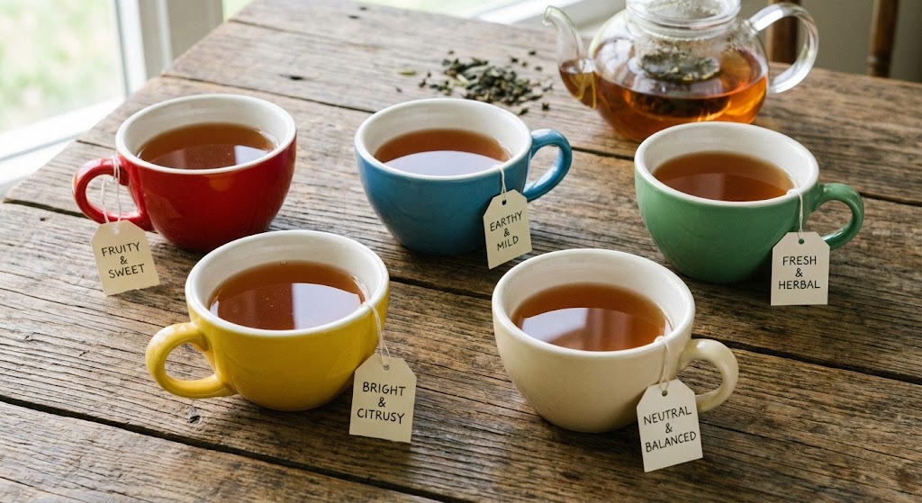
| Cup Color | Perceptual Effect | Best Tea Match | Avoid For |
|---|---|---|---|
| Red/Pink | +10-15% sweetness, +warmth, -bitterness perception | Black tea, oolong, builders' tea, rooibos | Teas where bitterness is desirable (certain greens, puerh) |
| White | +20-30% quality perception, +sophistication, clean aesthetic | All premium teas, comparative tastings, Gongfu ceremony | None (universally beneficial) |
| Blue/Gray | -10-15% flavor intensity, -appetite, mild suppression | Supertasters needing intensity reduction | All teas (generally undermines enjoyment) |
| Yellow | +8-12% sourness/acidity perception | Citrus teas, lemon blends, kombucha | Delicate greens, white tea, smooth oolongs |
| Green | +freshness, +natural, -sweetness perception | Green tea, matcha, herbal blends | Black tea, aged puerh, oolong (color mismatch) |
| Brown/Cream | +earthiness, +comfort, +authenticity for dark teas | Puerh, aged oolong, dark-roasted teas | Green tea, white tea (aesthetic mismatch) |
Why Coffee Shops Use White Cups
Starbucks, Blue Bottle, and specialty coffee chains exclusively use white ceramic for cappuccinos/lattes—not aesthetic preference, strategic psychology. White cups maximize perceived quality (+20-30%), justify premium pricing ($5 coffee), and create Instagram-friendly minimalism (white cup = "serious coffee culture").
Clear glass undermines coffee: customers see the color (brown), which primes "bitter" expectations and increases focus on imperfections (bubbles, separation). White cups hide the liquid, forcing customers to taste rather than judge visually. This same logic applies to tea: psychological research shows white cups universally enhance satisfaction.
The Price Placebo Interaction
Cup color amplifies price placebo effects. Expensive tea in a white cup tastes 35-40% better than expensive tea in a plastic cup (combined expectation boost). Cheap tea in a white cup gains 20-25% perceived value, while cheap tea in a disposable cup is rated poorly even if chemically superior.
This is why tea vendors use white porcelain for samples: the cup makes the tea taste better, increasing purchase likelihood. It's also why tea hoarders invest in matching teaware—the cup becomes part of the $200 puerh cake's value proposition.
Cultural Variations and Personal Associations
While crossmodal correspondences (red = sweet, blue = suppressed) are universal, cultural overlays exist. Chinese tea culture associates purple with aged puerh (Yixing purple clay), creating "authenticity" signals. Japanese tea culture associates black/dark brown with rustic wabi-sabi aesthetics, enhancing perceived traditionalism.
Personal associations also matter: if your grandmother served tea in blue floral cups, blue may trigger positive nostalgia, overriding appetite suppression. The Proust effect (memory-triggered emotion) can counteract crossmodal priming, but only when associations are strong and emotionally significant.
Practical Application: Choosing Cups for Tea Type
For black tea: Red/pink cups amplify sweetness, masking bitterness (ideal for Assam, Ceylon). White cups enhance quality (ideal for premium Darjeeling, Keemun). Avoid blue (suppresses richness).
For green tea: White cups maximize perceived quality (ideal for Dragon Well, gyokuro). Green cups reinforce authenticity (ideal for casual sencha). Avoid yellow (amplifies unwanted acidity).
For oolong: White cups are universal (works for light and dark oolongs). Cream/brown cups suit dark-roasted oolongs (aesthetic match). Red cups add warmth to lighter oolongs.
For puerh: Brown/cream cups reinforce earthiness. White cups elevate perceived quality (ideal for expensive aged cakes). Avoid blue/green (aesthetic mismatch).
For supertasters: Blue/gray cups reduce bitterness intensity by 10-15%—not a cure, but measurably helpful. Combine with cold brewing for maximum bitterness reduction.
Comments